Matplotlib常用操作
1 | import matplotlib.pyplot as plt |
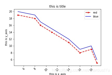
1.折线图
1 | x_axis = [5,8,9,11,14,16,18,19] |

1 | #plt.plot的常用参数如下 |
2.保存绘制的图像
1 | #保存图像 |
3.matplotlib输出中文问题
1 | from pylab import mpl |
4.绘图中的其他的操作
1 | # 设置坐标轴的取值范围 |
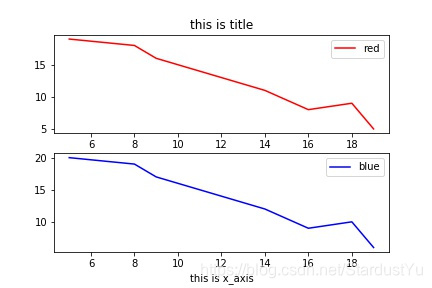
5.子图—subplot讲解
1 | plt.subplot(2,1,1) #构建一个2行1列的子图,此处在第一个子图进行绘制 |
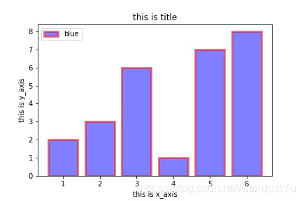
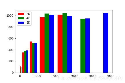
6.条形图绘制
1 | X = [1, 2, 3, 4, 5, 6] #每条bar的位置 |

1 | plt.bar(X,Y1,alpha=0.5,width=0.8,color='b',edgecolor='r',label='blue',linewidth=3) |
1 | plt.barh() #横着来显示数据 |

7.散点图的绘制
1 | x_axis = [5,8,9,11,14,16,18,19] |

8.直方图的绘制
1 | #直方图用来统计数据出现的频率 |

1 | plt.hist(Y,alpha=0.8,facecolor='b') |
1 | #绘制直方图的高级操作---一次绘制多个 |
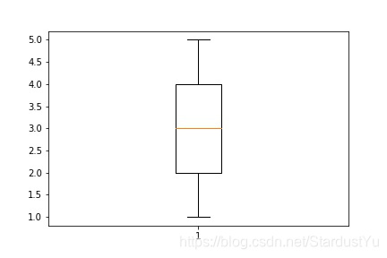
9.盒图
1 | Y=[1,1,2,2,2,3,3,4,4,4,4,5,5] |
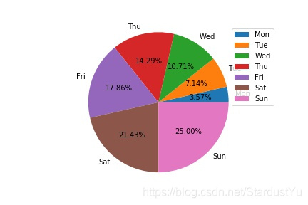
10.饼状图
1 | labels = ['Mon', 'Tue', 'Wed', 'Thu', 'Fri', 'Sat', 'Sun'] |

1 | plt.pie(data,labels=labels,explode=[0.1 for i in range(7)], startangle=90,shadow=True,autopct='%1.2f%%') |
本博客所有文章除特别声明外,均采用 CC BY-NC-SA 4.0 许可协议。转载请注明来自 BaiDing's blog!


%20%20Pandas%E5%B8%B8%E7%94%A8%E6%93%8D%E4%BD%9C/cover.jpg?raw=true)
%20%E8%AE%AD%E7%BB%83%E8%BF%87%E7%A8%8BTrick%E5%90%88%E9%9B%86/cover.png?raw=true)
%20%20%E9%9D%A2%E8%AF%95%E5%B0%8F%E7%9F%A5%E8%AF%86(1)/cover.jpg?raw=true)
%20%20%E9%9D%A2%E8%AF%95%E5%B0%8F%E7%9F%A5%E8%AF%86(2)/cover.jpg?raw=true)

评论